Custom Circular Picture Box C# win Form app
Custom Circular PictureBox in C# WinForm App RashiU
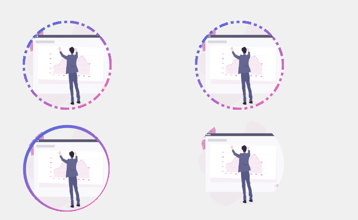
Hello every one In this article you will learn how to design custom circular pictureBox in c# windows form application.we we can construct custom Circular picture box by adding some appearance properties to existing Windows Form Picturebox . So we can change the border style of custom picture box.and we also change its border color and border size so we customized our own circular picture box.
you can download the source code and also copy the code below and follow the steps.
You may also like Custom DateTimePicker and RadioButton in C# windows form application .we will construct more custom Controls in c# win form application which will help you to design your own custom controls UI Tools. we Need Your supports please Subscribe our Official YouTube Channel RashiCode, after reading this article you will be able to design your own custom circular Picture Box
=>Open Visual Studio and Create new Windows Form application
=>After Creating project in win forms click on Solution Explorer
=>Then Right Click On Project Name => Add => Class
Open Class file Then inherit the Class with PictureBox add the code below
using System;
using System.Collections.Generic;
using System.Linq;
using System.Text;
using System.Threading.Tasks;
using System.Windows.Forms;
using System.Drawing;
using System.Drawing.Drawing2D;
using System.ComponentModel;

namespace RashiUI
{
class RashiCircularPictureBox:PictureBox
{
private int border = 2;
private Color colorBorder = Color.RoyalBlue;
private Color colorBorder2 = Color.HotPink;
private DashStyle borderstyle = DashStyle.Solid;
private DashCap borderCap = DashCap.Flat;
private float gradiant = 50f;

public RashiCircularPictureBox()
{
this.Size = new Size(95, 95);
this.SizeMode = PictureBoxSizeMode.StretchImage;
}

public int Border
{
get
{
return border;
}

set
{
border = value;
this.Invalidate();
}
}

public Color ColorBorder
{
get
{
return colorBorder;
}

set
{
colorBorder = value;
this.Invalidate();

}
}

public Color ColorBorder2
{
get
{
return colorBorder2;
}

set
{
colorBorder2 = value;
this.Invalidate();

}
}

public DashStyle Borderstyle
{
get
{
return borderstyle;
}

set
{
borderstyle = value;
this.Invalidate();

}
}

public DashCap BorderCap
{
get
{
return borderCap;
}

set
{
borderCap = value;
this.Invalidate();

}
}

public float Gradiant
{
get
{
return gradiant;
}

set
{
gradiant = value;
this.Invalidate();

}
}

protected override void OnResize(EventArgs e)
{
base.OnResize(e);
this.Size = new Size(this.Width, this.Width);
}

protected override void OnPaint(PaintEventArgs pe)
{
base.OnPaint(pe);

var graphic = pe.Graphics;
var rect = Rectangle.Inflate(this.ClientRectangle, -1, -1);
var rectborder = Rectangle.Inflate(rect, -border, -border);
var size = border > 0 ? border * 3 : 1;

using (var bordercolorG = new LinearGradientBrush(rectborder, colorBorder, colorBorder2, gradiant))
using (var path = new GraphicsPath())
using (var pen = new Pen(this.Parent.BackColor, border))
using (var penborder = new Pen(bordercolorG, size))
{

graphic.SmoothingMode = SmoothingMode.AntiAlias;
penborder.DashStyle = borderstyle;
penborder.DashCap = borderCap;

path.AddEllipse(rect);

this.Region = new Region(path);

graphic.DrawEllipse(pen, rect);
if (border>0)
{
graphic.DrawEllipse(penborder, rectborder);
}

}

}


}
}
Video tutorial
Click the button below for source code
Thank you for reading this article. Leave a comment if you have any question about this article. Please don’t forget to subscribe our official YouTube Channel RashiCode